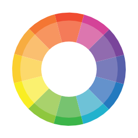
color wheel
The Origin Story
Let’s start with a bit of history. Sir Isaac Newton was the first to introduce the idea of a color wheel in the 17th century. When he wasn’t busy defining the laws of gravity, Newton was playing with prisms, bending light, and thus unveiling the spectrum of colors. From this spectrum, the first circular diagram of colors was born, laying the groundwork for what we now know as the color wheel.
Understanding the Basics
A color wheel is an invaluable tool for artists, designers, and anyone involved in creating visual content, as it visually illustrates the relationships between colors. To use a color wheel effectively, start by familiarizing yourself with its structure, which typically includes primary colors (red, yellow, and blue), secondary colors (orange, green, and violet), and tertiary colors (mixtures of primary and secondary colors). The wheel demonstrates how colors blend and contrast, offering insights into color harmony.
Using a color wheel manually requires a hands-on approach to learning and implementing the fundamental principles of color theory to your projects. Manually using a color wheel gives you a tactile and intuitive awareness of how colors interact, which can help you make more educated and effective color selections in any visual design. Here’s a step-by-step method for using a color wheel:

Identify color categories
Begin by familiarizing yourself with the three main categories of colors on the wheel:

Primary colors
Red, yellow, and blue are the three primary hues that form the basis of color theory. These fundamental hues cannot be formed by combining other colors, making them distinct and indispensable in the palettes of painters and designers. The primary colors serve as the foundation for all other colors on the color wheel.
By combining these colors in various ratios and proportions, you can produce a wide range of secondary and tertiary hues. Each main color has its own psychological importance and visual impact: red is frequently connected with energy and passion, yellow with joy and vibrancy, and blue with stability and dependability. Primary colors, because of their adaptability and purity, are effective instruments for conveying emotions and generating dynamic visual composition.

Secondary colors
Combining equal amounts of two primary colors yields secondary colors like orange, green, and violet. Orange is made up of red and yellow, green from yellow and blue, and violet from blue and red. These hues broaden the visual spectrum, providing more diverse and complicated alternatives for artists and designers. Secondary colors have their own psychological implications and can be employed to elicit a variety of emotions and atmospheres.
Orange mixes the intensity of red with the cheerfulness of yellow, resulting in a feeling of warmth and excitement. Green, which combines the peacefulness of blue with the exuberance of yellow, frequently represents nature and growth. Violet, which combines the solidity of blue with the passion of red, can evoke a sense of elegance and creativity. Secondary colors are essential to color harmony, allowing for more complex and expressive color schemes.

Tertiary Colors
Tertiary colors are sophisticated hues produced by combining a primary color with a surrounding secondary color, yielding a palette of six rich colors: red-orange, yellow-orange, yellow-green, blue-green, blue-violet, and red-violet. These colors provide depth and complexity to the color wheel, providing a broader spectrum of tints that can be tailored to certain aesthetic effects and moods. Tertiary colors fill the gap between primary and secondary colors, allowing for more seamless transitions and elaborate color harmonies in design.
Each tertiary hue acquires characteristics from its parent colors, resulting in distinct combinations that can elicit various emotions and atmospheres. For example, blue-green could be both peaceful and exhilarating, expressing both blue’s serenity and green’s vibrancy. Tertiary colors are vital for artists and designers looking to explore intricate color connections and create visually appealing and harmonious compositions.
Understand Color Relationships
Understanding color relationships is essential for successfully using a color wheel to produce visually appealing designs. These associations, defined by the arrangement and proximity of colors on the color wheel, guide the development of color schemes capable of conveying a wide range of emotions and styles.
Monochromatic

Analogous

Complementary

Split-Complementary

Triadic

Tetradic

Are you intrigued by the power of color harmony and want to learn more about it? Then go to PigmentMixology’s in-depth page.
Experiment with Tints, Shades, and Tones
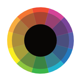
Experimenting with tints, shades, and tones is an important component of color theory that may significantly affect the atmosphere and depth of any artwork or design. By combining white with a base color, tints can create a lighter, softer, or more delicate appearance. Shades are created by adding black to a hue, which deepens it and frequently makes it more powerful or dramatic. Tones are created by adding gray to a color, which reduces the intensity while retaining its complexity.
This exploration results in a rich palette capable of conveying a wide range of emotions, moods, and visual interests. Adjusting these variables allows artists and designers to fine-tune the visual impact of their work, ensuring that the colors properly match the intended effect, whether it’s to calm, energize, or focus attention.
tints

shades

tones

Play with Color Properties and Temperatures
color properties
A lot of people think that color and hue are the same thing, but they’re not. Color is a generic term for all hues and tones. Each color has three basic properties that, when put together, determine how that color looks overall:

- Hue is a word for color that differentiates one from another. Chromatic hues include red, orange, yellow, green, blue, and purple. Achromatic colors include black, white, gray, and other grayed neutral tones, which means “without color.”
- Chroma (or saturation) assesses a color’s strength or purity, indicating how much it has been diluted with white or gray. A highly saturated color appears bright and rich, whereas a less saturated hue appears washed out or pale
- Value: Brightness (or lightness) determines how light or dark a color is, and it is inversely proportional to how much light the color appears to reflect.
bright

dark


desaturated

saturated

color temperatures
Color temperature is a visible light property that has numerous uses in photography, videography, lighting design, and art. It is measured in kelvins (K) and describes the heat or coolness of a light source.
- Lower color temperatures (2,000 to 3,000 K) are called “warm” and seem reddish-yellow, similar to the light from a sunrise or sunset.
- Middle-range temperatures (4,000 to 5,000 K) are characterized as “neutral” or “white” light, similar to the midday sun.
- Higher color temperatures (over 5,000 K) are called “cool” and have a bluish-white radiance resembling a cloudy sky or shadow.
The popular wisdom holds that red, orange, and yellow are warm colors, whereas green, blue, and purple are cool hues.
Warm colors are associated with fire, the sun, and embers, which may seem overused. Cools represent water, ice, and plant life. But color temperature can be subjective. Green can be perceived as chilly or warm, depending on individual perception.
cold

neutral

warm

Color temperature has an impact on the mood and perception of a room or image, which influences design and artistic decisions.
Apply To Your Project
Using your color scheme as a guide when choosing colors for your project is critical to creating a coherent and visually pleasing result. Whether you’re choosing paint colors for an artwork, fabric colors for fashion or interior design, or color palettes for digital applications like websites and graphic designs, your color scheme acts as a blueprint for aesthetic harmony and emotional resonance.
In art, the palette you choose can influence the piece’s tone and ambiance, as well as the viewer’s perception and emotional response. Colors in fabric and fashion design not only shape the look and feel of clothes or places but also reflect current trends and personal styles, which may influence the wearer’s or user’s comfort and mood. In digital applications, color schemes improve usability and the user experience by directing the viewer’s eye and reinforcing corporate identification.
By carefully picking colors that complement your planned scheme, you can develop a coherent visual language that speaks directly to your project’s objectives, ensuring that each piece works in harmony to convey the desired message or effect.
Adjust Based On Context
When selecting colors for your projects, it is crucial to consider their emotional impact and cultural context. Colors have inherent psychological qualities and can elicit distinct emotions; red might generate feelings of intensity or urgency, whereas blue can suggest relaxation and trust. Beyond their emotional influence, colors have significant cultural implications that vary greatly between nations; for example, white is usually linked with purity in many Western cultures, yet it represents grief in several Eastern cultures.
When choosing colors, consider the environment you want to create within your project as well as how your audience will perceive these hues. A children’s book may use bright and vivid colors to engage and thrill its young readership, but a business website may use a palette of blues and grays to convey professionalism and dependability.
Understanding the psychological and cultural meanings of colors allows you to adapt your color selections to resonate with your target audience, ensuring that the colors you choose not only generate the desired visual appeal but also match the viewers’ expectations and emotional responses. This deliberate use of color can improve the overall impact of your work, making it more relevant and accessible to your intended audience.
Practice using a color wheel And Observe
The best way to master the use of a color wheel is to practice and observe. Experiment with different color schemes for various jobs, noting which combinations work best and why. Regular practice, such as experimenting with different color schemes across a variety of tasks, is key. Whether you’re working on graphic design, painting, interior decorating, or digital media, experimenting with different color combinations helps you to experience firsthand how colors interact with one another and how they affect the overall composition. This hands-on experience is extremely beneficial in establishing an instinctive grasp of color harmony and contrast.
Observation enhances practice by requiring a critical analysis of how others use color. This can include looking at artworks, design portfolios, nature, and even common objects to observe how colors are used effectively. Pay attention to how different color schemes provoke emotions, capture attention, or blend into the environment. Examine the use of color in branding and advertising to understand how it affects perception and behavior.
Making notes on your observations and experiments is critical. Documenting color schemes that appeal to you or your audience, as well as those that do not, allows you to create a personal palette of effective combinations. Consider the context in which these colors were employed, the mood they conveyed, and their attractiveness to certain populations.
As you continue to practice and watch, you will begin to recognize patterns and concepts that drive excellent color choice. This continual practice not only improves your talents but also broadens your creative vocabulary, allowing you to make more informed and impactful color decisions in future projects.
