
color psychology
Introduction to Color Psychology
Color psychology investigates the complex ways in which different colors can influence human behavior, emotions, and overall psychological conditions. This fascinating field of study looks into how colors affect not just our moods and emotions but also how they influence our perception of seemingly unconnected parts of our lives, such as the flavor of food, the perceived potency of pharmaceuticals, and even the temperature of a room. Color’s subtle but deep influence can elicit a wide range of responses, from warmth and comfort to attentiveness and enhanced vitality.
Furthermore, color has been strategically used across a wide range of businesses to achieve certain objectives. Colors are carefully chosen in marketing to attract consumers and convey company identity, using people’s emotional connections to specific shades to drive engagement and loyalty. Colors are used in interior design to create settings that can influence the mood, productivity, or relaxation levels of the occupants, effectively enhancing the usefulness and aesthetic appeal of the environment.
Similarly, in therapeutic settings, color therapy, also known as chromotherapy, uses colors to heal, soothe, and balance people’s emotional and physical health. This multidisciplinary approach to comprehending and using color psychology emphasizes its importance in not only increasing our aesthetic experiences but also in improving numerous areas of human life and health.
Red: Passion and Urgency
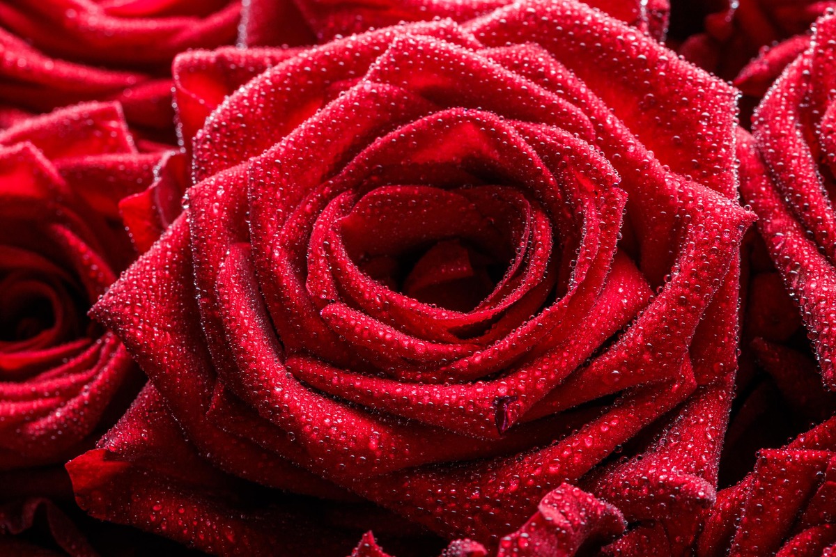
The color red, which is generally linked with passion, energy, and intensity, has a strong presence in color psychology. This brilliant color is considered to have a strong influence on human emotion and behavior, representing love and danger, warmth and violence. In psychological terms, red can stimulate the body, elevating blood pressure and heart rate, which is why it is commonly employed in situations requiring attention and immediate action, such as stop signs and emergency vehicles.
Furthermore, red is thought to enhance appetite, making it a popular colour in restaurants and food packaging. In marketing, red is used to generate a sense of urgency, urging customers to make speedy decisions, which is especially effective during clearance sales. On a cultural level, red has several meanings; for example, in many Asian traditions, it represents good fortune and prosperity, yet in Western nations, it can represent romance and passion.
Despite its energetic and inspiring features, red’s intensity requires caution in design and branding since excessive use can elicit sentiments of frustration or hostility. Thus, red’s psychological impacts are dual in nature, provoking a wide range of emotional responses depending on the situation and application.
Orange: Creativity and Enthusiasm
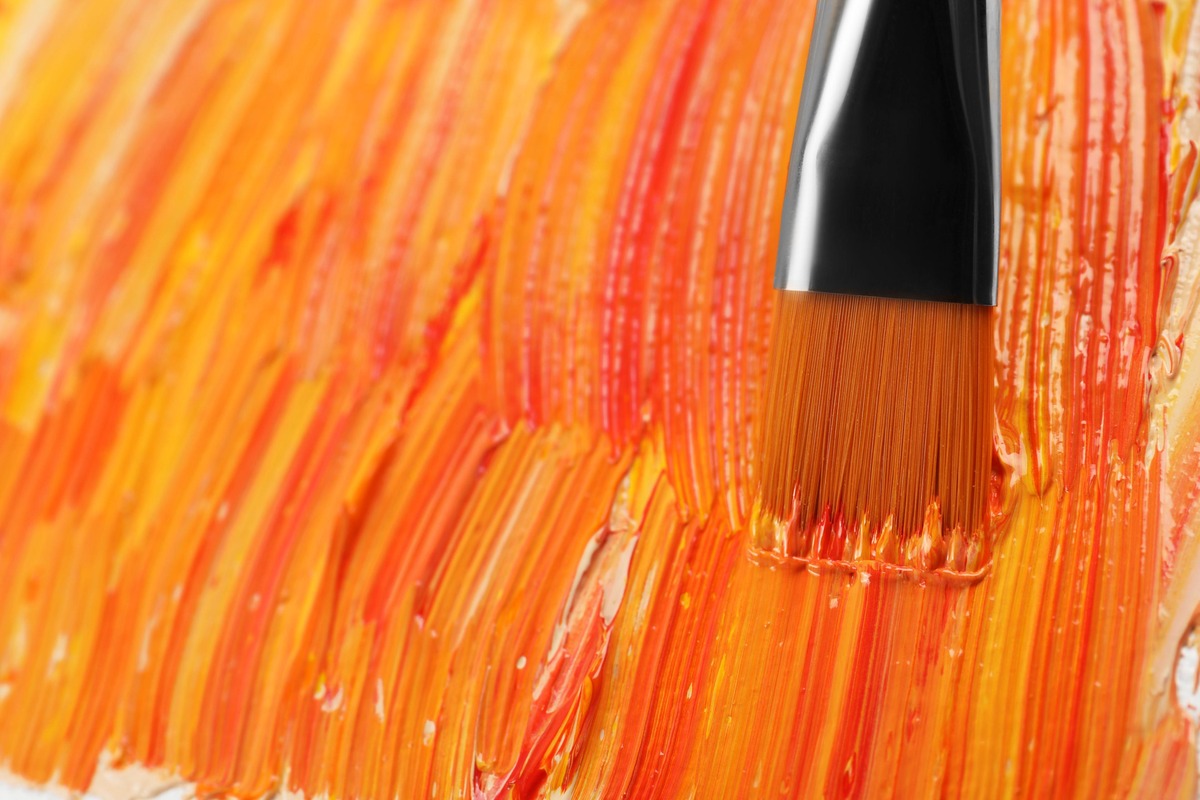
Orange, a color that exudes warmth and vibrancy, has a distinct position in color psychology by combining the fiery intensity of red and the cheerfulness of yellow. This combination produces a color that is frequently associated with inventiveness, energy, and a spirit of adventure. In terms of psychology, orange increases movement, socializing, and overall well-being and emotional vitality. It’s a color that can evoke sentiments of optimism and emancipation, making it a popular option for locations that promote creativity, such as design studios and collaborative offices.
In marketing, orange is utilized to capture attention without the harsh edge of red, giving off a friendly, inviting vibe. It’s especially useful in call-to-action buttons or promotions, where it can elicit immediate action while retaining a fun and friendly tone. Furthermore, orange has been shown to stimulate appetite, albeit not as strongly as red, making it an appropriate colour for food marketing and packaging. However, its use must be balanced, as too many bright colors can be overwhelming and communicate a feeling of frivolity or lack of seriousness if not utilized carefully.
Orange has a variety of cultural meanings; in Western cultures, it is connected with fall and harvest, yet in Hinduism, it denotes sacredness and purity. The psychological influence of orange highlights its ability to excite, uplift, and inspire, making it an effective tool in visual communication and design.
Yellow: Happiness and Energy
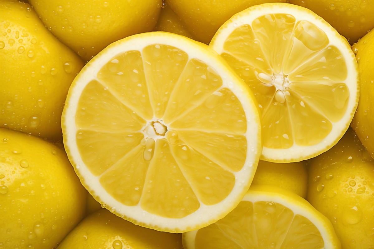
Yellow, sometimes known as the color of sunlight, represents warmth, brightness, and vigor and plays an important part in color psychology. This vibrant and eye-catching color is universally associated with joy, optimism, and enlightenment, increasing brain activity and eliciting emotions of bliss. Psychologically, yellow is said to improve mood, increase communication, and boost confidence. Its capacity to improve concentration and metabolism makes it ideal for advertising signs and interior spaces that require inventiveness and mental agility.
However, because of its intensity, yellow should be used with discretion; extremely bright colors can strain the eyes and, if used excessively, can cause feelings of annoyance or rage. In marketing, yellow is frequently used to draw attention and communicate a sense of optimism and vitality, making things appear more accessible and affordable. It works especially well in window displays and point-of-sale items to capture the attention of customers.
Yellow has different cultural meanings; in some cultures, it represents joy and prosperity, while in others, it represents caution or cowardice. Despite these variances, yellow’s psychological impact is clear: it has the ability to uplift and illumine, altering both people’s moods and cognitive functioning. The right use of yellow can give spaces and things a lively, inviting, and revitalizing vibe.
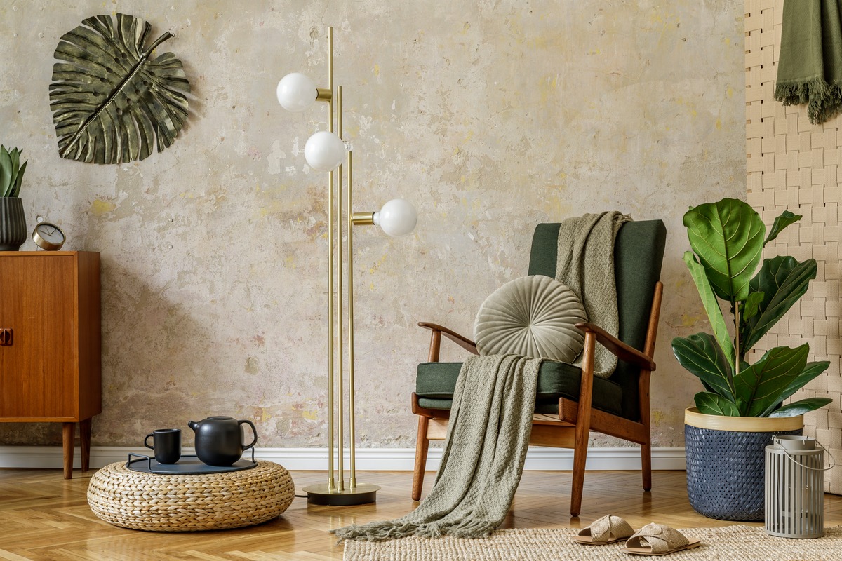
Green: Harmony and Growth
Green, the hue most associated with nature, represents development, harmony, and rebirth, highlighting its importance in color psychology. This color, which takes up more area in the visible spectrum, is known for its relaxing and soothing properties, which help to reduce anxiety and provide a sense of tranquility. Green represents balance and stability psychologically, instilling feelings of safety and comfort that promote emotional well-being. It is frequently utilized in locations intended to relax and revitalize, such as hospitals, schools, and workplaces, to relieve stress and improve feelings of balance and harmony.
Furthermore, because green is associated with health and vitality, it is a popular branding color for organic and vegetarian products that emphasize natural and sustainable attributes. Green is used in marketing to convey eco-friendliness and sustainability, which appeals to environmentally sensitive consumers. Its capacity to alleviate mental weariness makes it ideal for use in businesses and educational settings, where it can improve focus and productivity.
Green has multiple cultural meanings; in some situations, it represents luck, freshness, and fertility, while in others, it represents envy or a lack of experience. Green’s psychological influence is multidimensional, capturing the essence of life and the natural world, making it a flexible and popular color in design and communication. Its use can foster a quiet and therapeutic environment, encouraging a sense of balance and rebirth.

Blue-Green: Serenity and Healing
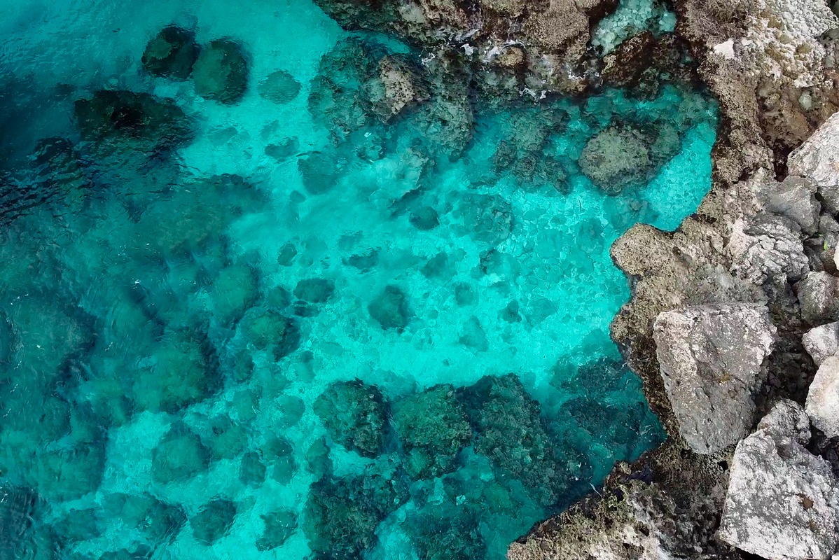
Blue-green, which is frequently linked with the tranquil beauty of tropical oceans and lush landscapes, holds a unique place in color psychology, combining the calming aspects of blue with the regeneration and growth represented by green. This beautiful color generates a sense of calm and healing, making it very useful in settings and designs that promote relaxation and well-being.
Psychologically, blue-green is perceived as relaxing and protective, providing a respite from the stresses of everyday life. It promotes emotional balance and stability, lowers anxiety, and improves mental clarity. This color is commonly used in therapeutic areas such as spas and hospitals, where its relaxing affects can aid in physical and mental wellness.
Blue-green is utilized in interior design to produce a quiet and refreshing ambiance that may transform any area into a tranquil refuge. Its link with crystal-clear waters and natural beauty makes it an excellent choice for promoting products and services relating to cleanliness, water, and environmental sustainability.
In branding, blue-green can express a message of serenity and dependability, appealing to consumers who seek refuge in the purity and freshness represented. The psychological influence of blue-green highlights its ability to relax and revive, making it an effective tool for improving emotional well-being and generating a sense of harmony with nature.
Blue: Calmness and Trust
Blue, a color firmly ingrained in the human brain, represents calm, stability, and tranquility, demonstrating its tremendous significance in color psychology. The color of the sky and the water represents depth, trust, and knowledge. Blue is psychologically connected with a sense of serenity and tranquility; it has the unique ability to lower blood pressure and pulse rate and calm the mind, making it universally preferred for creating spaces that promote relaxation and concentration. This color increases productivity and is commonly used in offices and educational institutions to improve concentration and mental clarity.
In marketing, blue is selected because it is associated with dependability and integrity, making it a favorite choice among financial institutions, technological firms, and healthcare providers looking to portray security and professionalism. Blue is also an appetite suppressant, which explains why it is rarely used in food branding or restaurants.
Blue is culturally connected with loyalty, honesty, and authority, and it is frequently utilized in uniforms and business branding to convey confidence and responsibility. However, excessive use of blue can elicit feelings of coldness or detachment, emphasizing the significance of balance in its use. Blue has powerful psychological impacts, allowing designers and marketers to tap into the collective unconscious to create places and brands that evoke peace, stability, and trust.

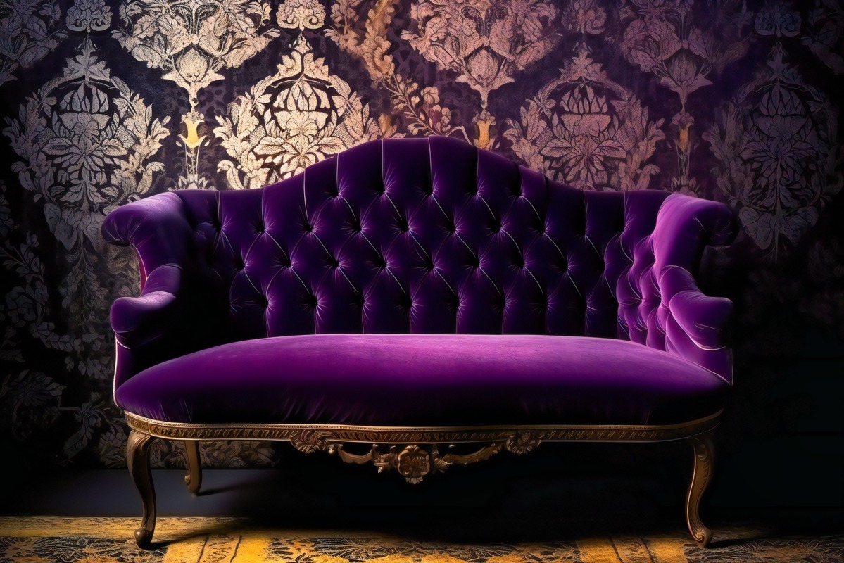
Purple: Luxury and Creativity
Purple, a color historically associated with monarchy, elegance, and mysticism, has a unique place in color psychology because it combines the stability of blue with the vitality of red. This rich color represents creativity, knowledge, and spirituality, creating an atmosphere of contemplation and elegance. Purple has the psychological ability to stir the imagination and inspire high aspirations, making it a popular option in branding and design for products and services that want to express exclusivity, refinement, and innovation. Its application in meditation settings and creative sectors aims to improve introspection and creativity.
Purple is commonly used in marketing to attract an audience looking for originality and quality, as it creates feelings of richness and grandeur. However, because purple is uncommon in nature, it can appear unnatural or induce sentiments of contemplation to the point of introspection. Darker colors of purple are connected with richness and opulence, while lighter lavenders are perceived as romantic and nostalgic.
Despite its intricacy, purple has a strong psychological impact, eliciting feelings ranging from restful and motivating to energizing and opulent. It exhibits color’s ability to alter perception and behavior, making it an effective tool in visual communication and design for eliciting certain emotional responses while conveying a feeling of depth and complexity.
Pink: Compassion and Serenity
Pink, a color frequently associated with warmth, tenderness, and love, has a special position in color psychology because it represents compassion, caring, and understanding. This delicate color, derived from the mix of red’s passion and white’s purity, elicits sentiments of caring, tranquility, and reassurance. Pink is considered soothing and comfortable in psychology, with a relaxing influence on the senses and the ability to reduce sentiments of hostility and fury. It is commonly employed in settings that attempt to instill a sense of safety and vulnerability, such as nurseries and children’s healthcare facilities.
Pink’s link with femininity and innocence has grown throughout time, making it an effective color for marketing products geared at women and young girls; however, this association is increasingly being questioned and reconsidered. Pink, when used in branding, can convey humor, attractiveness, and a current, youthful attitude, appealing to a wide audience by defying typical color conventions.
However, pink must be used in moderation and context, as excessive use might be seen as too sentimental or immature. Pink’s psychological influence emphasizes its potential to evoke sentiments of warmth, affection, and inner calm, making it a useful color for enhancing emotional well-being and positive interactions.
Black: Elegance and Mystery
Black, a color that inspires a wide range of powerful and frequently contradicting feelings, has a special place in color psychology. It embodies authority and sophistication while also representing grief and mystery. In psychology, black is connected with strength, seriousness, and depth, and it frequently conveys a sense of beauty and timelessness.
This color may give the impression of perspective and depth, making it a popular option in fashion due to its slimming impact and ability to express a sense of elegance and power. In branding and design, black is utilized to make a strong statement about luxury, exclusivity, and a certain sense of mystique. High-end brands utilize it to represent status and timeless elegance. However, because black represents darkness and the unknown, excessive use of the color may trigger unpleasant emotions such as depression or overwhelm.
Black can represent both the positive (such as formality and elegance) and the negative (such as death and evil). It has a significant psychological impact since it can provoke dread or the unknown while also providing a grounding effect by signaling the end or the potential of new beginnings. Black’s diversity and depth make it a powerful visual communication tool, capable of provoking a wide range of emotions and responses, from elegance and refinement to solemnity and meditation.

Gray: Neutrality and Balance
Gray is a quintessential symbol of neutrality and balance in color psychology, straddling the sharp contrasts of black and white. This color represents peace, sophistication, and practicality, providing a muted background that can either comfort or communicate a sense of detachment and indifference. Gray is frequently associated with dependability, modesty, and maturity, conveying a feeling of timeless, understated elegance.
Its use in interior design and fashion reflects a desire for sleek, elegant simplicity, appealing to individuals looking to create a traditional yet contemporary atmosphere or ensemble. Gray, in branding and marketing, can represent safety, dependability, and firmness, making it a popular choice for the technology and automotive industries that want to create an image of stability and innovation without overloading the senses.
However, an overreliance on gray may result in feelings of loneliness, sadness, or a lack of vitality since its neutrality can lean toward the impersonal or chilly if not tempered with warmer or more lively hues. Gray is frequently perceived as conservative and formal, lacking the emotional intensity of more vivid colors but providing a consistent, calming presence that makes it versatile and widely useful in a variety of circumstances. Gray’s psychological complexities highlight its ability to integrate, support, and transition, providing a foundation for other hues to shine while generating a sense of balance and composure.
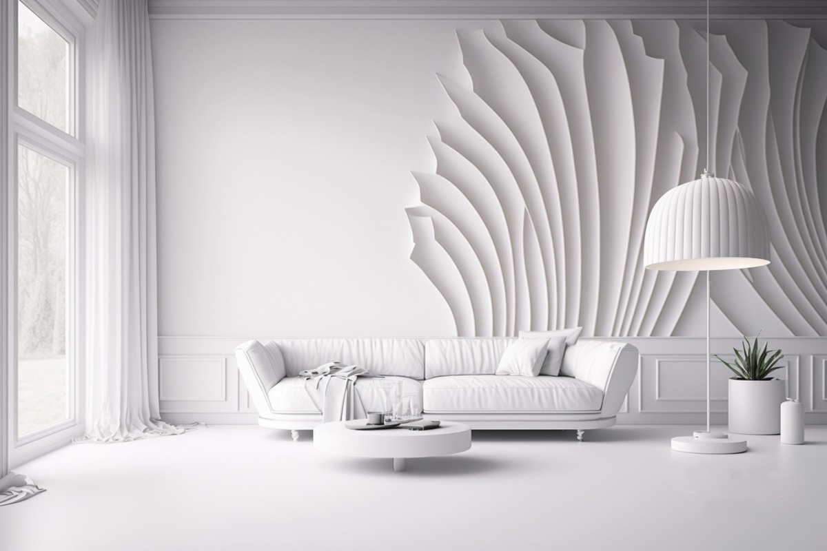
White: Purity and Simplicity
White, long seen as the pinnacle of purity, cleanliness, and simplicity, holds a treasured place in color psychology. It is a color that fully reflects light, symbolizing clarity, innocence, and calm. Psychologically, white is associated with new beginnings, representing freedom and openness to possibilities. Its use in a variety of disciplines demonstrates its ability to generate a sense of spaciousness and order, making it excellent for creating environments that are serene, uncluttered, and invigorating.
In design, white is widely used to represent simplicity and minimalism, resulting in a sense of serenity and tranquility. It is also used in branding to convey sophistication and elegance, notably in the luxury products industry, where it represents purity and high quality. However, excessive use of white can contribute to feelings of coldness and isolation, as its starkness can appear unwelcoming and sterile if not tempered with warmer features or hues.
White has a variety of cultural meanings, expressing grief in some cultures and jubilation and purity in others. White has a significant psychological impact because it can inspire creativity by giving a blank canvas while also promoting mental clarity by minimizing visual clutter. Its adaptability makes it an effective visual communication tool, capable of generating a wide range of emotions, from peace and simplicity to sophistication and refinement, depending on the application and environment.
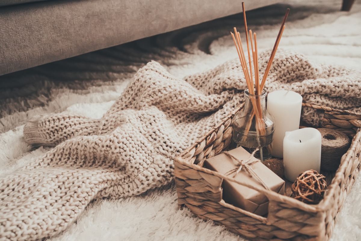
Neutral/Natural: Stability and Comfort
Neutral or natural colors, which include tones like beige, ivory, taupe, and various grays, have a distinct and versatile place in color psychology. These hues are frequently connected with natural components, generating feelings of stability, comfort, and balance. Neutral colors are perceived as calming and grounding, creating a sense of serenity and tranquility without the stimulus or emotional intensity associated with brighter hues. They provide a sense of understated elegance and timeless sophistication and are frequently used in design and fashion to provide a backdrop for other colors to stand out or to convey a subtle, polished aesthetic.
Neutral hues are popular in interior design because they help to make spaces feel open, airy, and light, resulting in a soothing and welcoming environment. They are very good at creating a minimalist style, emphasizing simplicity and clear space. In marketing and branding, neutrals are frequently used to convey quality, durability, and timelessness, appealing to an audience that values subtlety and sophistication. However, misuse of neutral colors can make a place or design appear flat, lifeless, or lacking in personality.
The psychological impact of neutral hues stems from their adaptability and capacity to create a tranquil, steady basis in both visual and emotional terms. Their use can express a sense of dependability and practicality, making them useful in a number of scenarios where the goal is to create a peaceful, harmonious, and balanced visual environment.
Taupe/Khaki: Practicality and Earthiness
Taupe and khaki, earthy tones that fall somewhere between brown and gray, communicate a sense of dependability, practicality, and unpretentious elegance in color psychology. These colors are reminiscent of natural elements like stone, wood, and soil, which lends them a sense of stability and resilience. Taupe and khaki are psychologically connected with simplicity, sturdiness, and versatility, and they frequently evoke sensations of peace and ease. They are popular in fashion and interior design because of their ability to blend effortlessly with a wide spectrum of colors, providing a subtle, classy backdrop that highlights the presence of other colors.
In branding and marketing, taupe and khaki are used to convey a sense of dependability and timeless quality, appealing to consumers who respect modest elegance and practicality. These colors can also convey a sense of connectedness to nature, making them excellent for eco-friendly and sustainable brands. To avoid a repetitive or overly conservative look, these tones should be balanced with more lively colors.
Taupe and khaki have a calming and reassuring psychological affect due to their earthy, grounded nature. Their adaptability and quiet elegance make them a popular choice for designing spaces and goods that exude durability, quality, and understated sophistication.
Brown: Reliability and Groundedness
Brown, a rich and earthy tone, has a strong resonance in color psychology as a sign of stability, reliability, and groundedness. This color, which is symbolic of the earth, wood, and stone, exudes strength and support while also instilling emotions of warmth and security. Brown is psychologically related to robustness, dependability, and sincerity, and it frequently conveys a sense of honesty and well-being. Its natural and warm properties make it a popular choice for interior design, where it is used to create pleasant, inviting rooms that promote relaxation and well-being.
Brown is valued in fashion for its adaptability and everlasting appeal, providing an air of sophistication and elegance that transcends seasonal fads. In branding and marketing, brown can convey a message of durability, dependability, and natural quality, making it an excellent choice for outdoor products and services, organic commodities, and artisanal craftsmanship. However, brown must be balanced with brighter colors or textures to avoid appearing too heavy or drab.
Brown’s psychological impacts stem from its relationship with the soil, which provides a grounding effect that can help people feel more connected to the natural world and one another. Brown’s use can generate a sense of stability and reassurance, making it an effective color for designing places and items that represent reliability, comfort, and true quality