color harmony
Color harmony is a fundamental idea in the visual arts and design, with a critical role in generating aesthetically beautiful and functional compositions. At its core, color harmony is the intentional selection and arrangement of colors based on their connections on the color wheel, resulting in a sense of balance and visual coherence in a composition.
Understanding and using color harmony principles allows artists and designers to elicit specific emotions, convey messages more forcefully, and capture the attention of their audience. Whether it’s using complementary colors to create dynamic contrasts, analogous colors for a serene and unified look, or the sophisticated use of triadic and tetradic schemes for vibrant diversity, mastering color harmony is essential for anyone looking to elevate their creative work.
Monochromatic

The term “monochromatic” originates from two Greek words. “mono,” meaning single or alone, and “chroma,” meaning color. Thus, monochromatic literally means “one color.”
Monochromatic color schemes combine a single base hue with its numerous tints, shades, and tones to produce a unified and visually appealing design.
This strategy simplifies color selection by focusing on a single color while allowing for a rich and subtle study of depth and texture within one hue. A designer can generate a refined and elegant look by changing the base color’s luminance and saturation while still maintaining visual appeal through tiny variations.
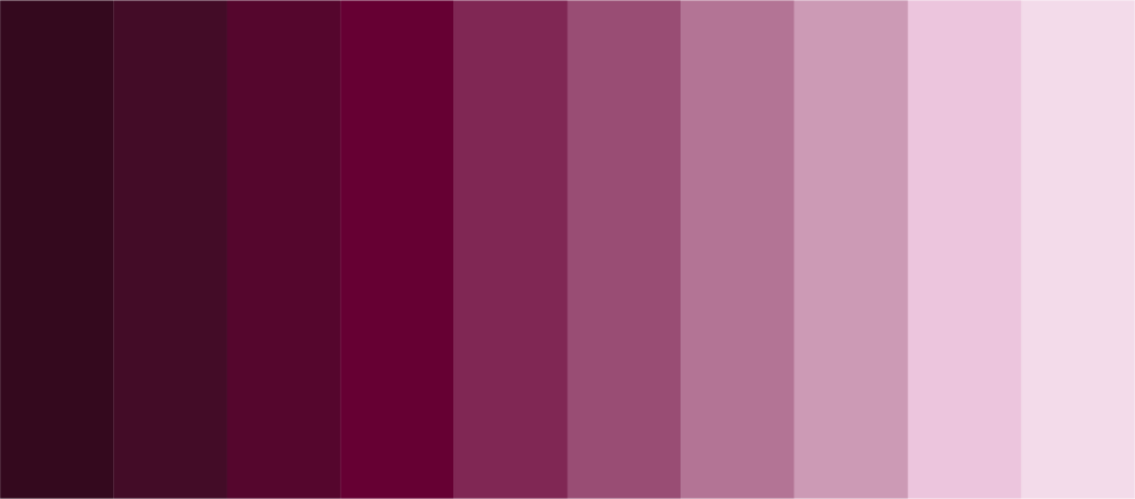


Check out more monochromatic color palettes in my coolors collection!
Analogous

Analogous colors are three or more hues that sit adjacent to each other on the color wheel, sharing a common hue and resulting in a harmonious color scheme.
Typically, this scheme incorporates one prominent color, which is usually a primary or secondary color, as well as two or more nearby hues that contribute to the design’s overall unity and coherence. Because of their close association on the color wheel, analogous color schemes are especially effective for generating tranquil and comfortable designs. They provide a delicate yet visually pleasing palette that can convey both warmth and coldness, depending on the hues used.

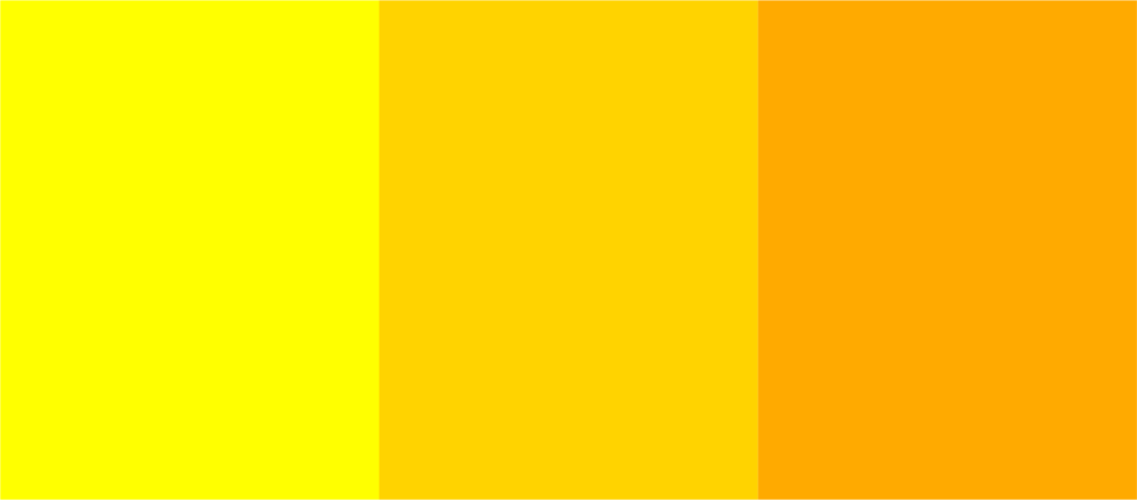
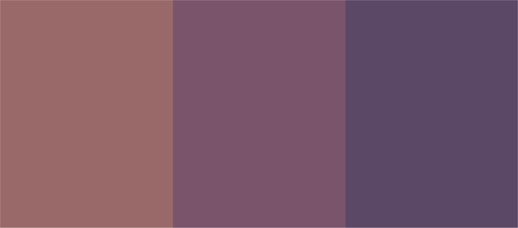
Check out more analogous color palettes in my coolors collection!
Complementary

Complementary colors are those that appear opposite each other on the color wheel, such as red and green, blue and orange, or purple and yellow.
This color scheme is noted for its great contrast and vibrancy, making it a popular choice for projects that want to stand out or get noticed. When used together, complementary colors increase each other’s brightness and produce a dynamic visual effect that can make things stand out. When these colors are blended in painting or printing, they can negate each other, resulting in a variety of gray tones.
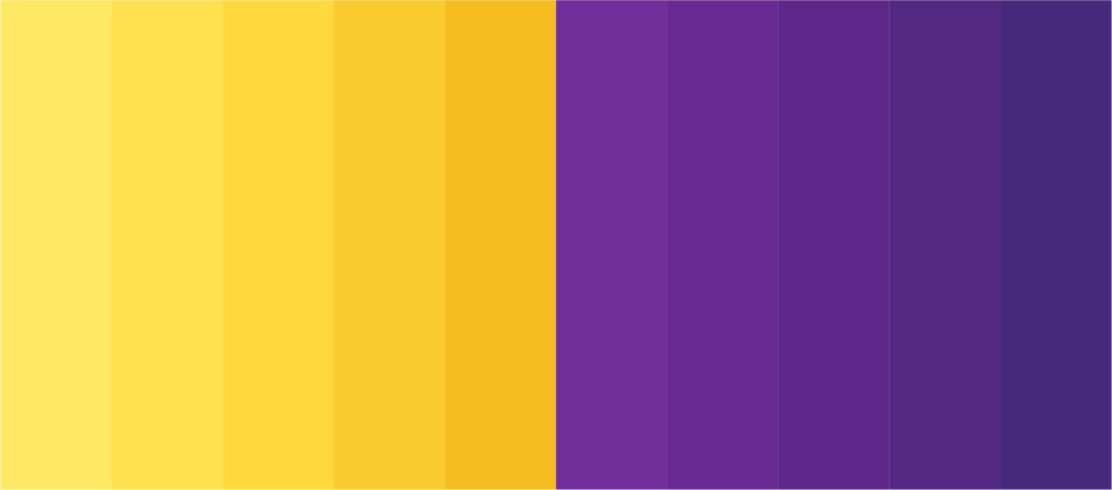

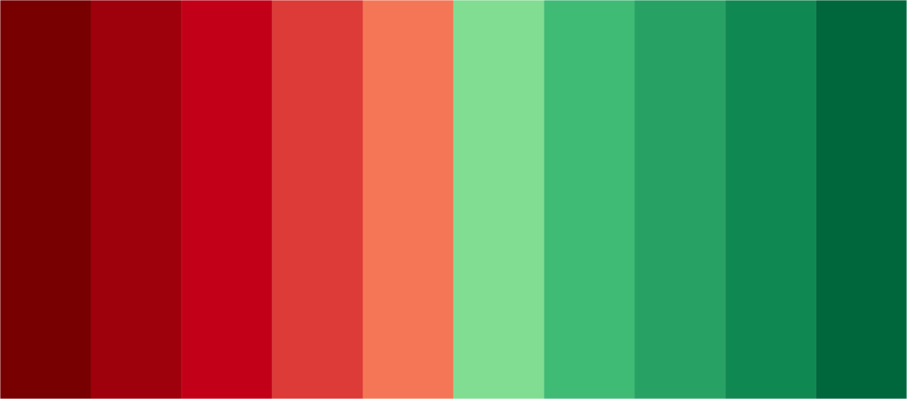
Check out more complementary color palettes in my coolors collection!
Split-Complementary

Split-complementary color schemes include a vivid yet balanced palette made up of three colors: a base color and two nearby tertiary colors that complement it.
This design is a variation on the complementary color scheme, but with a softer contrast, making it more versatile and easy to coordinate. The split-complimentary technique delivers the visual intrigue and contrast of complementary colors while avoiding visual strain by selecting colors that are close to each other’s complementary colors.


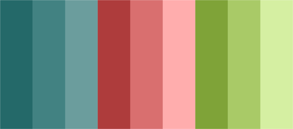
Check out more split-complementary color palettes in my coolors collection!
Triadic

Triadic color schemes are brilliant and harmonious groupings of three colors spread evenly across the color wheel to make a perfect triangle.
Common examples are primary colors, secondary colors, and any trio that maintains an equal distance on the wheel.
This design is praised for its strong contrast and bright yet balanced visual appeal. Triadic schemes accomplish harmonic variation by evenly spreading the visual weight of the colors, making them perfect for dynamic and energetic designs that don’t overwhelm the spectator.
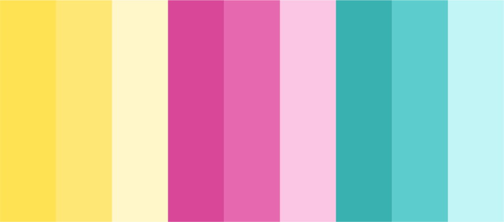


Check out more triadic color palettes in my coolors collection!
Tetradic

Tetradic (or double complementary) color schemes combine four colors into two complimentary color pairs.
This method produces a rich and diversified palette by generating a rectangle or square on the color wheel, which incorporates a wide spectrum of hues. The tetradic scheme is noted for its complexity and vibrancy, providing numerous opportunities to create contrast and harmony within a design. When properly balanced, this scheme can provide a dynamic and visually stimulating effect, making it ideal for projects that want to be eye-catching and lively. However, due to its intricacy, color balance and dispersion must be carefully considered to prevent overloading the observer.


Check out more tetradic color palettes in my coolors collection!
Embracing Color Harmony: Elevating Your Creative Vision
To summarize, color harmony is more than just a set of principles for selecting colors; it is a powerful tool that, when mastered, can transform the impact and attractiveness of any visual piece. Artists and designers can create compositions that are not only visually attractive but also have a strong emotional resonance with their audience by expertly employing color harmony principles.
Whether you’re a seasoned expert or a novice artist, understanding the basics of color harmony gives you a world of creative possibilities and innovation.
Remember that practicing, experimenting, and paying close attention to our surroundings are essential for developing color harmony. Exploring and implementing these color correlations can help you take your projects to new heights of aesthetic beauty and effectiveness.
